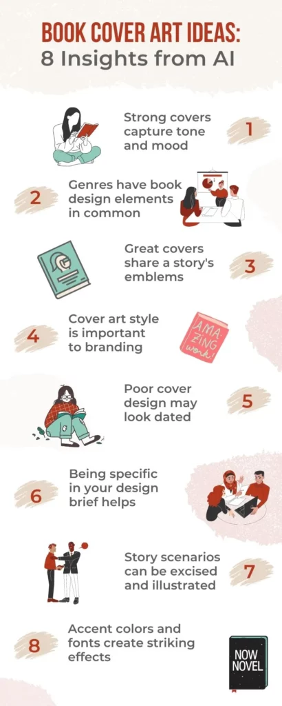
The best book cover art ideas distill genre, themes, and the unique appeal of the story between the covers. Strong book cover design is vital for ensuring your book stands out in a crowded physical or digital marketplace. Read 9 insights from using AI to find book cover design inspiration:
We used AI to brainstorm book cover art ideas and found:
- Strong covers capture tone and mood
- Genres have cover design elements in common
- Great covers share a story's emblems
- Cover art style is important to branding
- Poor cover design may look dated
- Being specific in your cover design brief helps
- Story scenarios can be extracted and illustrated
- Colors and fonts make great accents
- Image generators help you find options
Let's explore book cover design with the help of DALL·E 2 by OpenAI. This is 'a new AI system that can create realistic images and art from a description in natural language'. It joins the company's other developments, such as their AI writing tools:
1. Strong covers capture tone and mood
Do people judge books by their covers?
In a (fairly small) sample of 487 readers, the features rated most important when deciding to purchase a book were:
"Title”, "Synopsis”, “Subject covered in book”, “Recommendation of family and friends” and “Books with discount/on sale”
Luís Leitão et al., 'Do consumers judge a book by its cover? A study of the factors that influence the purchasing of books', Science Direct
Although these different variables go into readers' book choices, it's undeniable good cover design helps your book stand out.
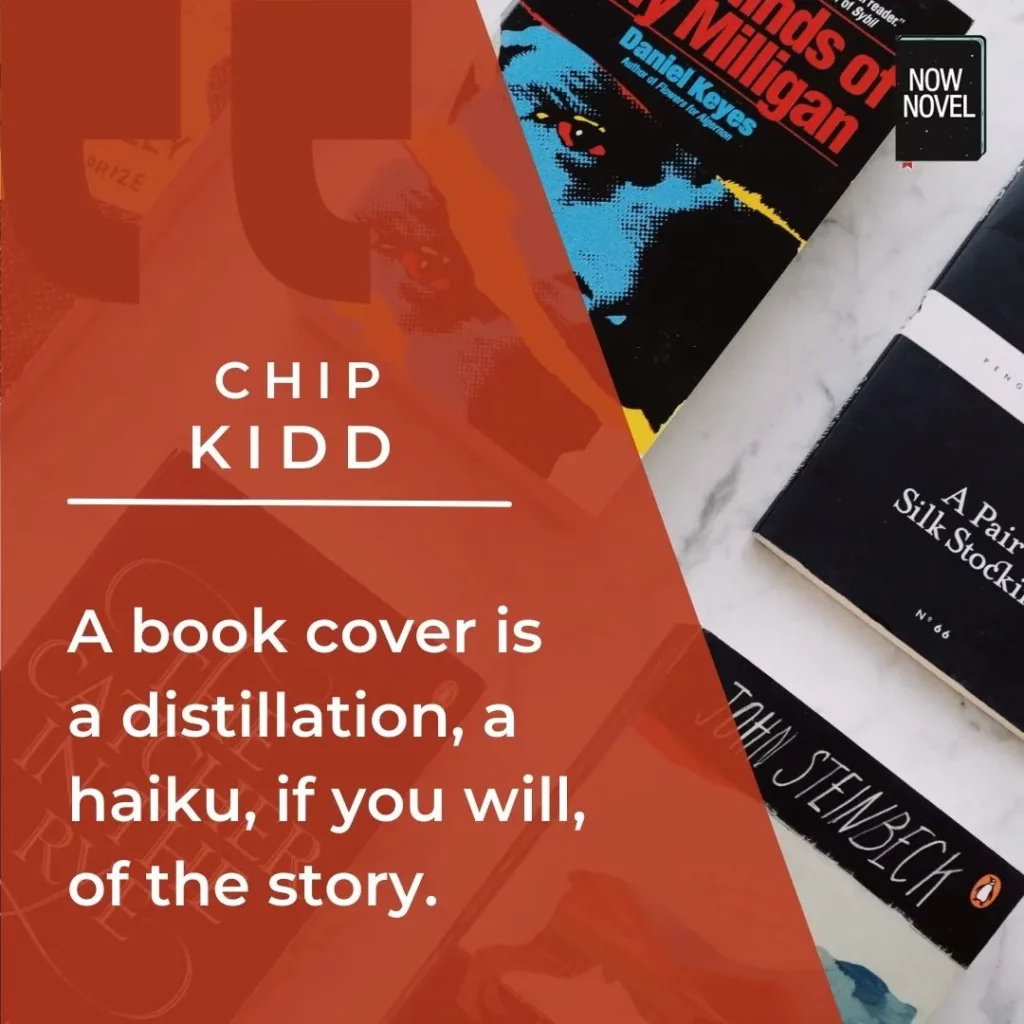
Cover designer Chip Kidd (who created all the covers for the first editions of Haruki Murakami's novels in the US) says:
A book cover is a distillation, a haiku, if you will, of the story.
Chip Kidd, quoted in 'Creating visual haikus for stories: Chip Kidd at TED2012'
Example of apt tone and mood in romance book cover design
We gave the following prompt to DALL·E 2 to see how AI image generation would depict a trope-filled travel romance:
'Cover of a romance novel showing two lovers on a tropical beach, digital art'. The results:
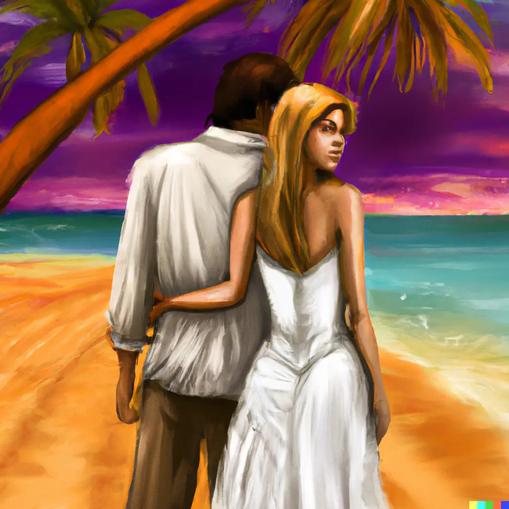

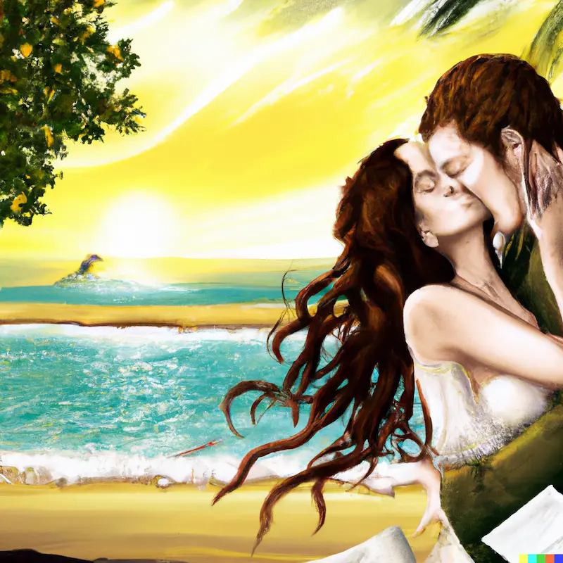
It's clear in these book cover art ideas that the third image would be the best starting point.
Details that make it a better source for a feel-good travel romance cover include:
- The illustrated characters' passionate abandon (their eyes being closed in an embrace)
- The light and glow of the golden hues in the image suggest radiant warmth
- The evocative quality of the woman's cascading hair which suggests movement
- The scenery in the background better suits an uplifting romantic story
If the story were darker (e.g. a romantic suspense novel) the other images would fit better. Their art style is much more amateur-looking, though (the red paint on the couple looks as though they've gotten on the wrong side of PETA).
2. Genres have cover design elements in common
There are striking similarities between book cover art ideas in the same genre. Just look at the covers of bestsellers in the 'Mystery, Thriller & Suspense' category on Amazon, for example:

Books in these categories mostly tend to use either:
- Cool combinations of blue and black with cold undertones (like Freida McFadden's The Housemaid)
- 'Hot' color schemes suggesting danger or conflict (the splash of blood next to the wedding rings on Jeneva Rose's The Perfect Marriage, or the moody sunset scene for Robert Bailey's Rich Blood).
We explore genre trends and differences in cover design further in this post on how to create a book cover.
Examples of book cover art ideas for suspense created using AI
We put the following prompt into DALL·E 2:
'Mystery book cover design about a disappearance, digital art'
The book cover design inspiration generated:
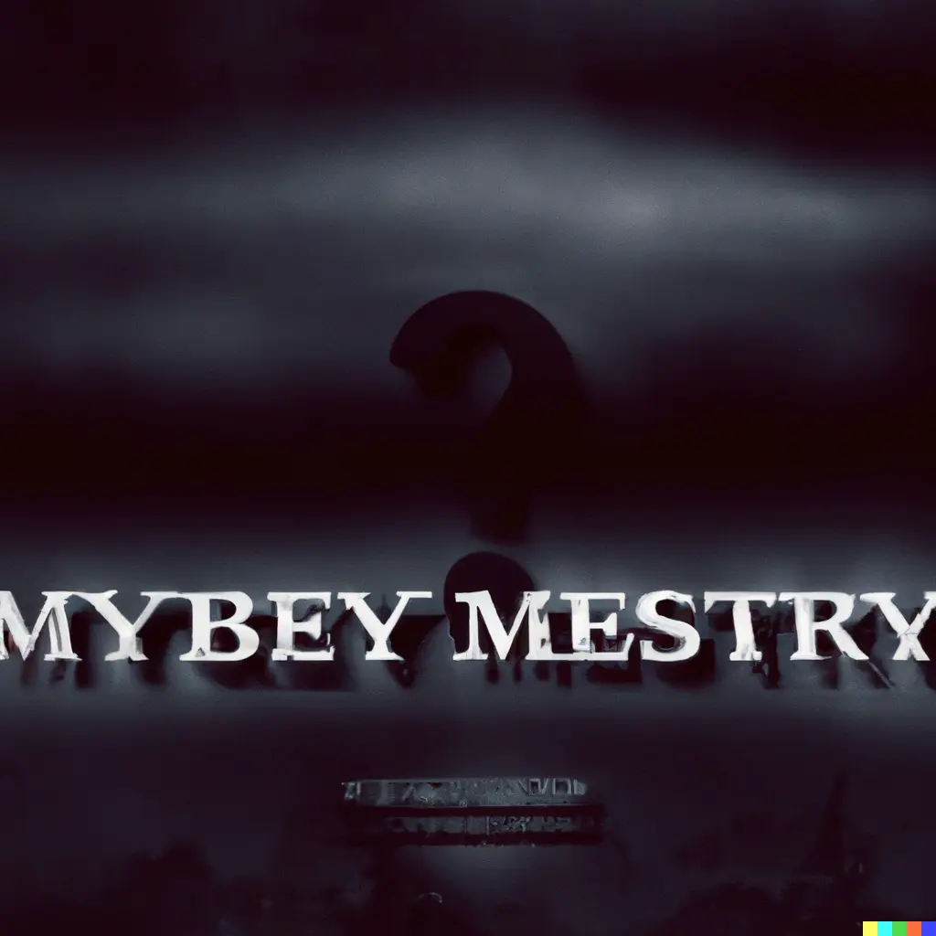
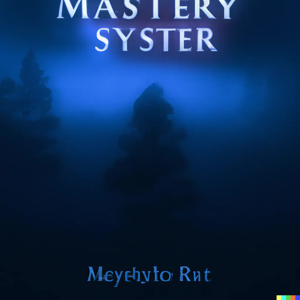
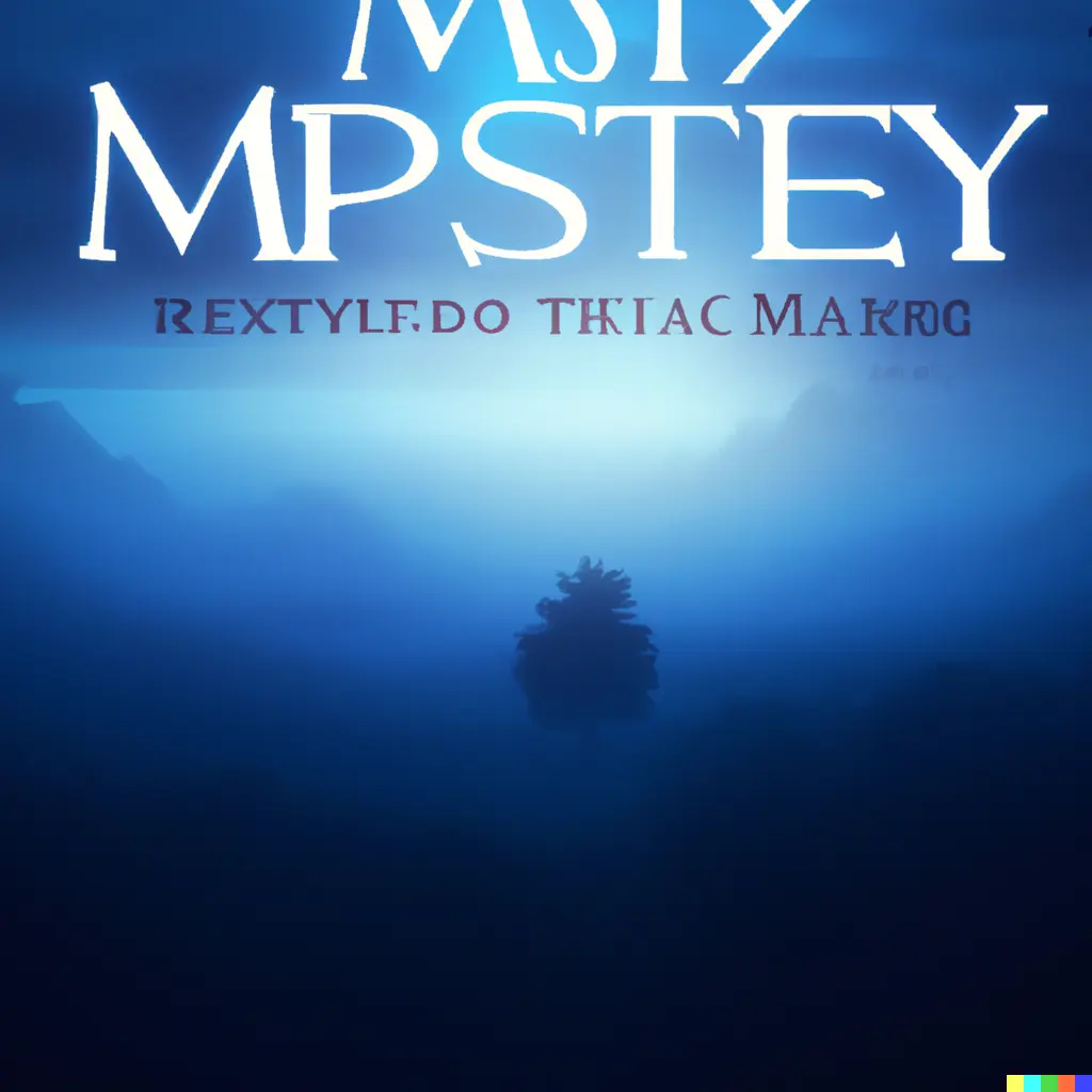
All three images feature the usual suspects in mystery novel covers - cool hues, check. Obscuring fog - check.
Note how the results returned are fairly generic. Keep reading for more on how being specific in your cover design brief helps ensure a more apt cover.
3. Great covers share a story's emblems
Many great book cover designs feature an object, place or other detail emblematic of the story.
For example, Penguin Classics' clothbound cover for Mrs Dalloway by Virginia Woolf uses an embossed print design of a biplane swooping through clouds.
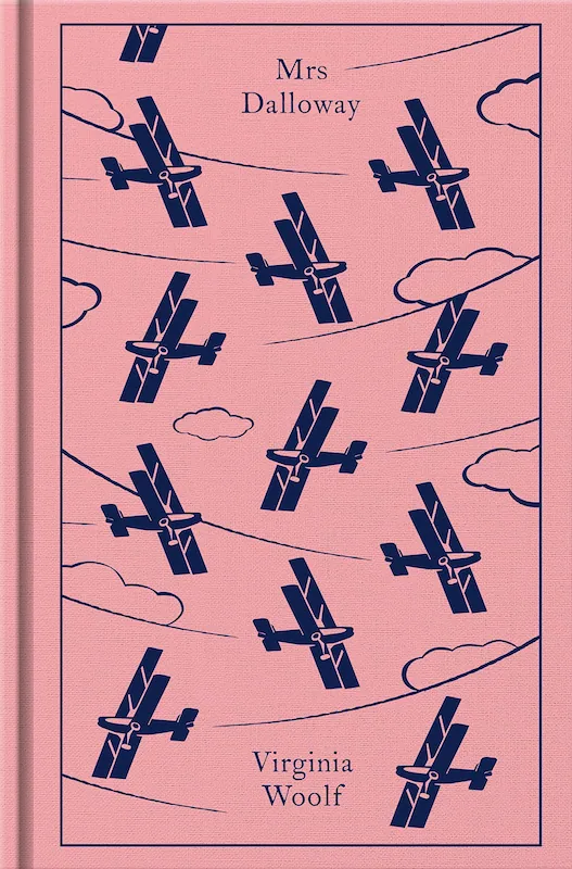
This symbol is emblematic of the era in which Mrs Dalloway (1925) is set, (between the world wars).
The cover design also echoes a passage in the story. Characters are gathered below a plane whose skywriting they attempt to decipher as it fades into air.
What objects or symbols in your book represent your story's era, themes, or key events? These could provide great cover design inspiration.
Examples of emblems in cover design
The cover design above for Jeneva Rose's The Perfect Marriage is a good example of how representative emblems can hint towards a book's key themes and tone.
In this case, a not-so-perfect marriage is implied by a spill of blood next to marriage rings. The word 'perfect' using a strikeout effect in the title suggests imperfection.
In the process of finding book cover art ideas and inspiration, we put the following prompt into DALL·E 2:
'Cover of a YA novel about a boy who backpacks his way across the country with just his guitar and a pet mongoose.'
The output:
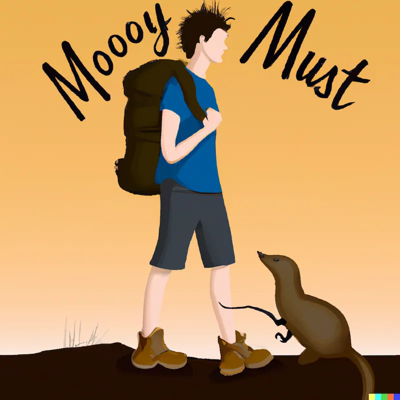
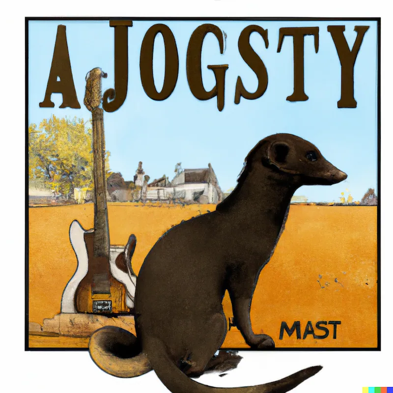
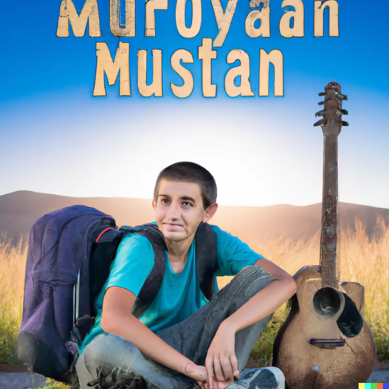
The second output is a strong example of how you can turn key emblems from a story into cover art. Two core symbols from the story feature. Even the background suggests an open country setting.
The middle image shows how you can nod towards your book's contents without overdetermining how your reader pictures your characters.
On that last point, Orhan Pamuk says of cover design:
I always think that it's wrong to put images of my protagonists on the cover of my novels because readers can identify with characters only if they are given the chance to imagine them independently.
Orhan Pamuk, in The Innocence of Objects
4. Cover art style is important to branding
'Your author brand is your promise to your reader', author JT Lawrence writes in our publishing course workbook, 'Authentic author branding'.
Great book cover design not only encapsulates what is appealing and captivating about your book's contents. It also signals key elements of your author brand in general.
Think of RL Stine's Goosebumps books and their gooey, ghoulish title font. It's a clear, visual brand signature.
How you brand a fantasy series in design choices will naturally differ from memoir, thriller/suspense, or another genre.
This reflects in the book cover art ideas we had DALL·E 2 generate:
Example of genre-specific design and branding: Memoir
We fed the following prompt to the tool:
'Cover of a memoir about living with a very entitled ostrich.'
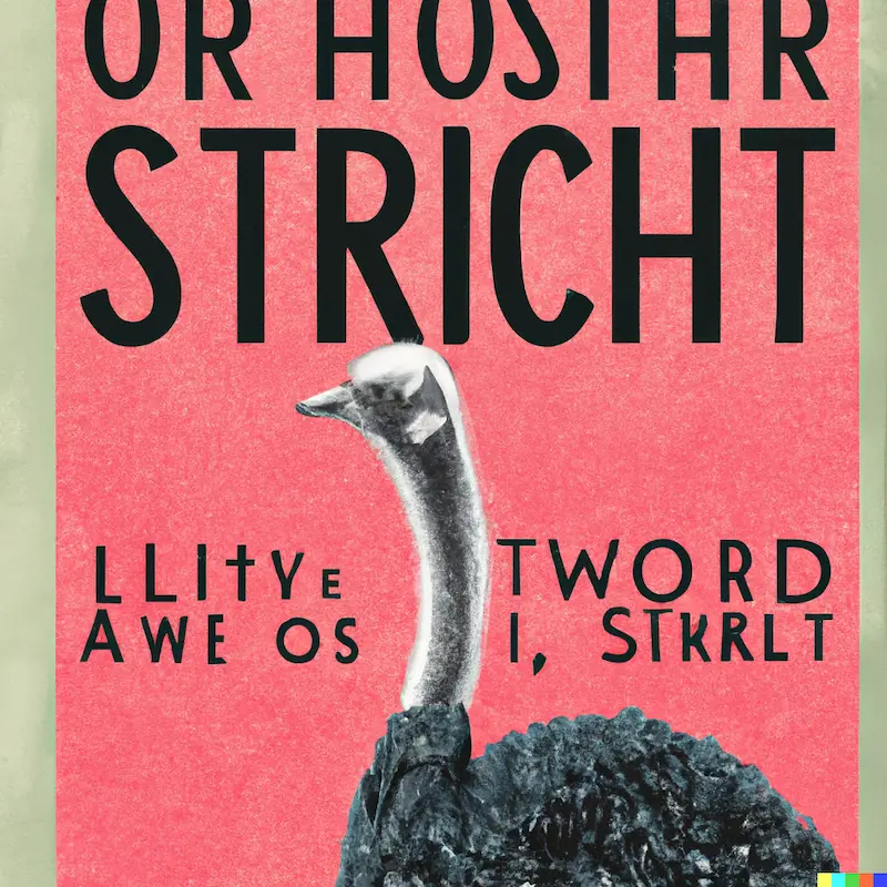
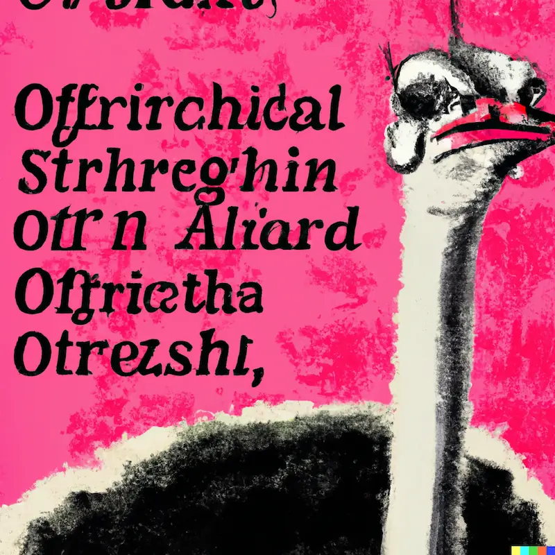
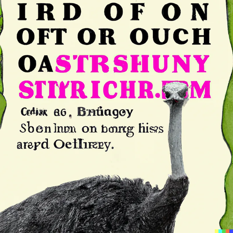
The memoir book cover art ideas generated capture common elements of memoir cover design. For one, the use of bold accent colors. Many memoir covers have this kind of flat design.
Secondly the bold featuring of the ostrich mentioned in the prompt is an example of the 'emblematic' approach to cover design described above. Here, it suggests droll humor. In how the ostrich partially eclipses some of the text in the third version especially.
The AI image generator tool was effective in suggesting the memoir genre, the story's central emblem, and a note of absurd comedy, elements that could be used in a series to create a recognizable author brand.
5. Poor cover design may look dated
AI-generated book cover designs don't get everything right, of course. Human artists aren't going out of business anytime soon.
One thing an AI tool might not have (depending on its data set and how it's been trained) is a sense of era-appropriate style, or the nuances of what is current vs what is dated or passé. Professional cover designers have deep understanding of design history and context.
DIY book cover design that reaches for the obvious font or art style could look dated.
Example of a dated or retro design
A retro book cover design might not be dated, it is worth adding. You may want, for example, to capture a specific era (the way ITC Benguiat was used for the title for the Netflix series Stranger Things to evoke nostalgia, for example).
We fed DALL·E 2 this prompt:
'Cover of a science fiction novel of an average joe from earth meeting alien leaders on a faraway planet, digital art.'
The output is replete with green-outlined font that calls to mind the title font of cult 1990s series Twin Peaks:
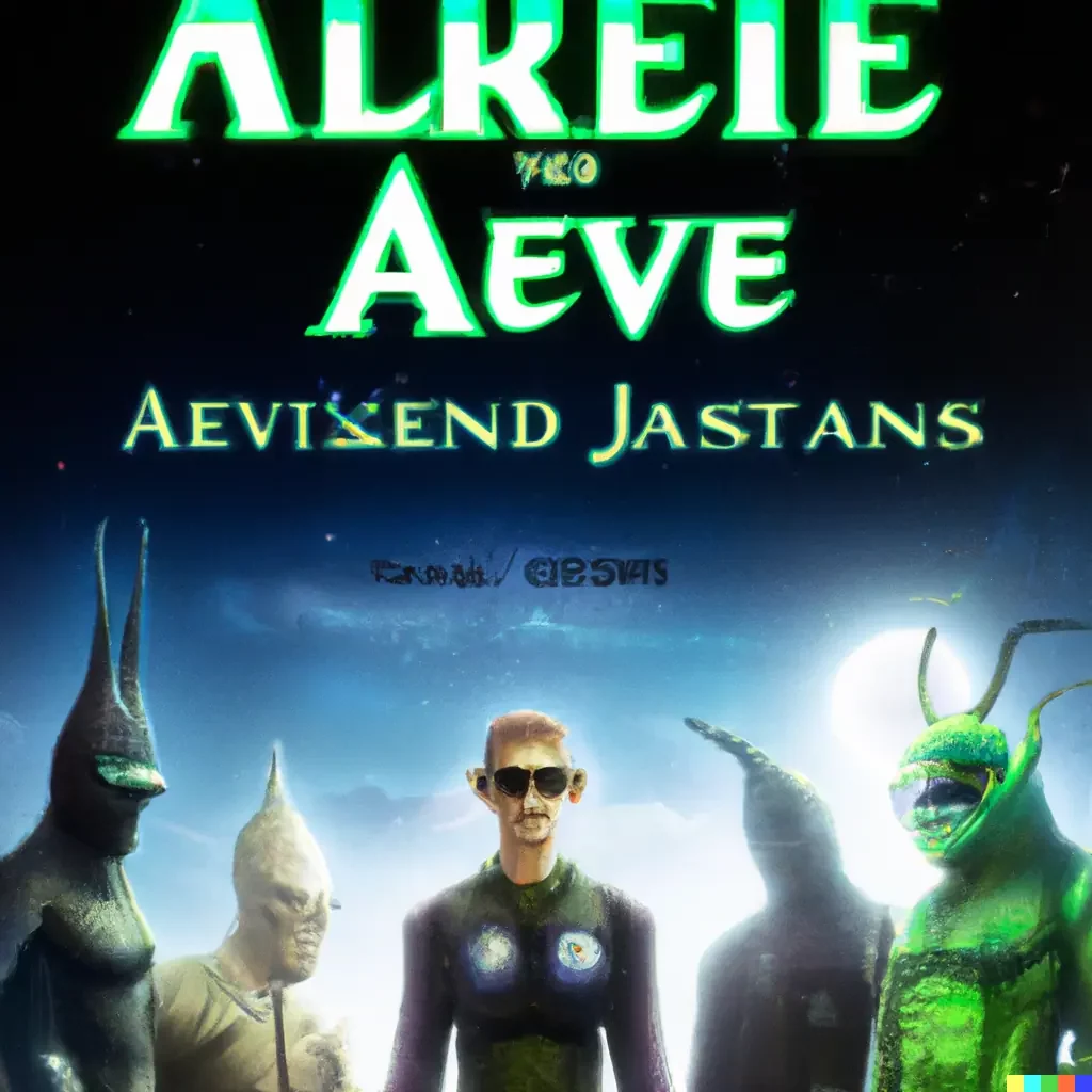
When you compare to more modern science fiction book cover designs such as Cixin Liu's The Three-Body Problem (2014, Tor Books), you notice that modern sci-fi novels also use non-serif fonts, along with digital art in a more modern style (and scarce neon green title font outlining).
6. Being specific in your cover design brief helps
Above, you see the generic mystery book cover art ideas that resulted when we wrote a more generic prompt.
If we add more specific detail to our mystery book cover brief, we get more interesting, specific design inspiration:
Example of book cover art generated using a specific brief
The first mystery book cover design prompt we tried was 'Mystery book cover design about a disappearance, digital art'. So far, so 'tree silhouettes in blue/black fog'.
What if your cover design brief were more specific? When we give details such as:
- Place
- Scenario
- Objects
Then the cover design inspiration AI returns is more detailed and interesting. See the captions for the tweaks that were made to the design prompt:
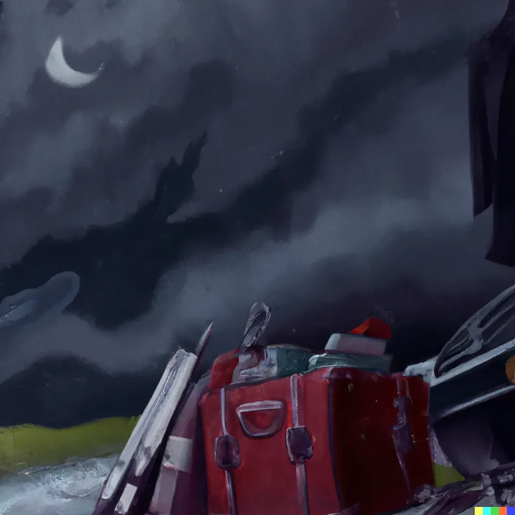
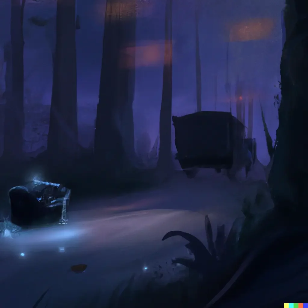
There is further utility in this tool for generating ideas for book cover art. You can edit out and replace specific contextual elements. For example, we could replace the vague belongings above with more detailed items.
7. Story scenarios can be extracted and illustrated
One way to find book cover art ideas is to extract and illustrate a specific scenario or scene from the story.
For example, the 1978 cover of C.S. Lewis' The Lion, the Witch and the Wardrobe features a stylized depiction of the Pevensie children (the four protagonists). It shows them crossing through the secret portal in a wardrobe into the wintry world of Narnia:
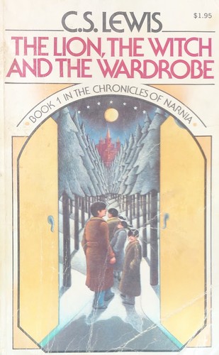
This is an effective approach to turning a key event from your story into an illustrative cover or dust jacket.
Example of using a story scenario for novel cover design ideas
We took the SparkNotes summary of the opening scene of Dickens' classic novel Great Expectations . We fed the summary to DALL·E 2 to generate book cover ideas:
Pip, a young orphan living with his sister and her husband in the marshes of Kent, sits in a cemetery one evening looking at his parents' tombstones.
Staff writers, SparkNotes
The resulting cover design inspiration is quite fitting:
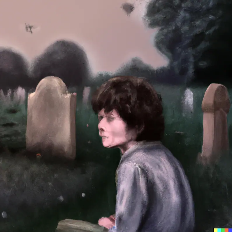
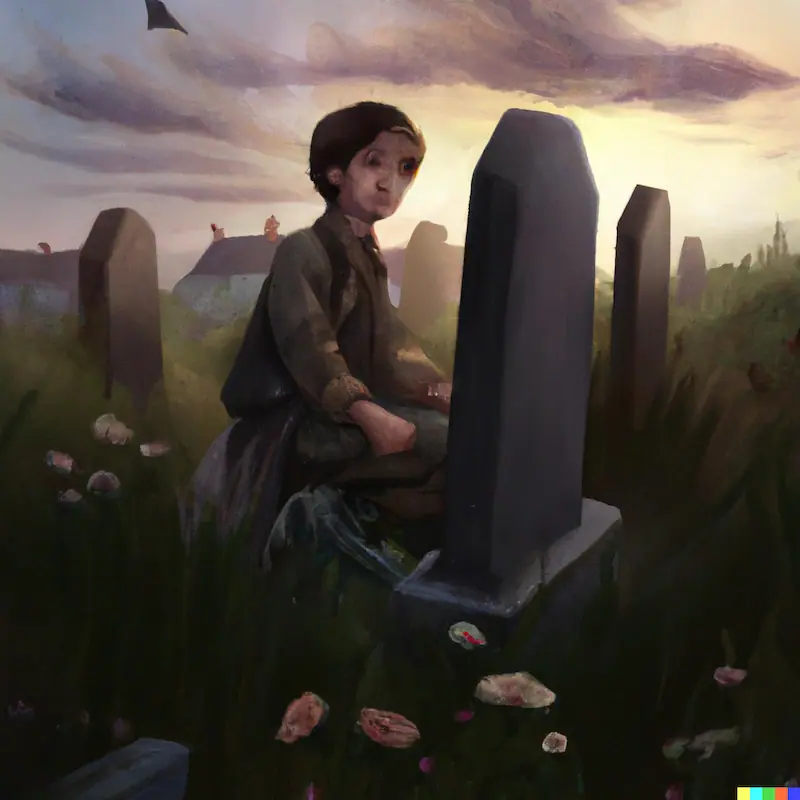
The second image fits the sense of Pip's childlike innocence and the novel's elegiac tone best.
It arguably better captures the light and shade of Dickens' humorous characterization and Pip's 'rags to riches' story.
8. Colors and fonts make great accents
In great cover art design ideas, there is judicious use of color and font. Penguin's clothbound classics (such as the Mrs Dalloway cover above) use embossed prints in a simple, duotone color scheme.
For example, this cover for George Eliot's Middlemarch with its brooch-like crest print in gold on an antique-looking dusty pink beautifully suggests family, heirlooms, social class, inheritance. The themes and subjects of the novel:
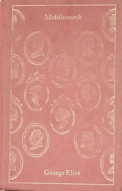
Penguin's book designers also chose a classic-looking, simple serif font for the novel's title and author. This conveys the quality of classicism in its elegant simplicity.
Example of using color and font accents
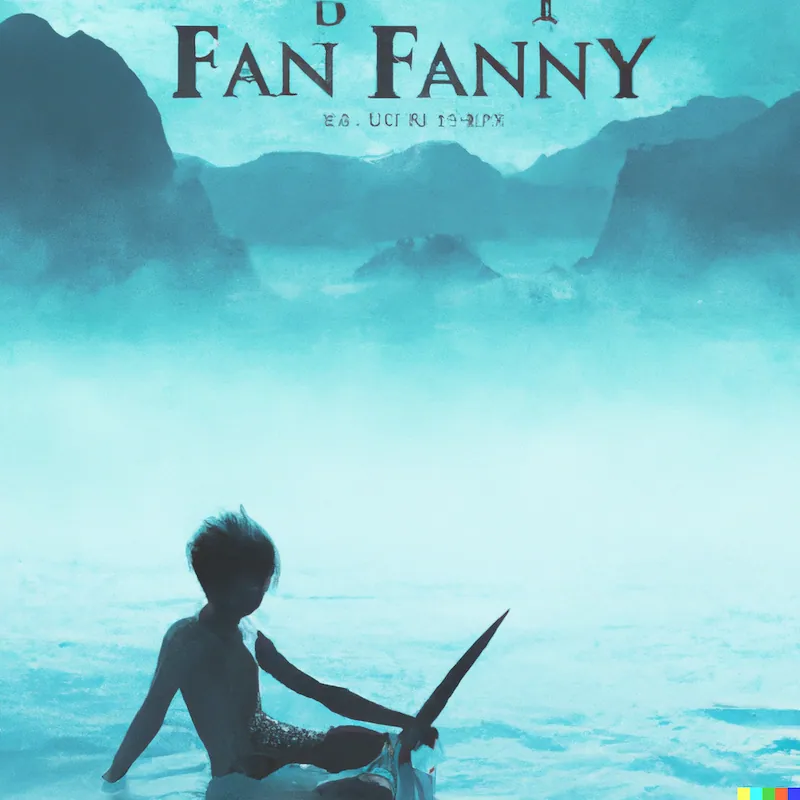
We fed the following prompt for an imaginary fantasy novel cover to DALL·E 2:
'Teal fantasy book cover where a young boy sails across a vast sea alone, digital art'.
Awkward author name aside, the digital art created shows how picking an accent color creates strong visual mood:
9. Image generators help you find options
Book cover art ideas may be challenging to find if you aren't a trained or practiced designer or artist. AI image generators such as DALL·E 2 help you set some parameters for design elements such as:
- Image subject matter/content
- Design composition (such as object placement)
- Color schemes and combinations
- Art style
- Tone and mood
By using tools to create images that speak to you fast, you can finesse your concept of how you want your book's cover to look. This is useful whether you're an author or book designer.
Generating random images from specific natural language prompts also helps you think about why some images work for specific stories, genres and scenarios better than others.
What are some of your favorite book covers? Tell us in the comments.
Join Now Novel and get help to develop a book with constructive feedback from a writing community that cares.
Subscribe to our newsletter
One million authors use our writing resources to get their books published. Come join them.

Very useful advice, as usual. Thank you!
Billy - Over 2 years ago
Thanks, Billy! Thank you for reading today's article.
Jordan - Over 2 years ago
Very cool and helpful (as usual); however, what this article didn't mention is that you have to be invited to use the AI book cover service. There's no clarity on how this works. I've put myself on their waitlist but would love some insight on how to actually use and access this service.
Cj Schepers - Over 2 years ago
Hi CJ, thank you for reading our blog and point taken! There is currently a waiting time but as these tools become more developed I'm sure access will be more open (there are already various commercial tools such as Sudowrite and copy.ai that help with textual inspiration, but these are paid tools so there may be some cost involved). Once you are approved to test the app out it's fairly simple, you're sent an email with a link to log in and you see a search box much like Google where you describe the image or scene you want to see and four options are generated (you can then generate iterations of any of the four, download one or more, or edit and contextually replace objects in any). Currently (as of August '22) you get 50 free credits (searches) in your first month, then I think 15 per month thereafter but can buy packs of credits fairly affordably. Per image this works out much cheaper than stock photography, though I wouldn't recommend this necessarily as a replacement as you can see from the examples that some subjects, e.g. human faces, are not yet totally polished. The legality of using these images commercially is still under discussion as well. That's also why I recommend using it as an inspiration-aiding tool primarily. I hope this helps!
Jordan - Over 2 years ago
Thanks. I'm going to look at all my published books and see how I can connect their covers with the right mood, tone and objects.
Todd Hicks - Over 2 years ago
Great, Todd! Many books get new cover designs for further editions. I quite prefer the one from a 1978 edition of The Lion, the Witch and the Wardrobe I discuss here to the more modern ones featuring the lion Aslan from the story; newer is not always necessarily better. I hope you find cover design ideas that speak to you and your audience.
Jordan - Over 2 years ago
Thanks for the speedy response! Yup, I would never use these as final artwork. I'm a book ghostwriter and this would be helpful for my clients who insist on conceptualizing their own covers. It's a challenge because most of the time they want to cram everything about the book into the cover. Oh em gee. Nothing worse than having a great story punched in the face by a terrible cover.
Cj Schepers - Over 2 years ago
It's a pleasure, CJ. I hear you! I would never either, and it's interesting when you say people often want to 'cram everything about the book into the cover' as that's the exact opposite of what Chip Kidd says about a cover design being a distillation or haiku of the story (you could give them his quote). I think these tools are useful for jogging ideas and inspiration, but I also question the ethics of automating what are valuable (and already marginal and often underpaid) artistic activities. So I also advocate saving up to pay artists over using AI or DIY for anyone who wants a more professional end result.
Jordan - Over 2 years ago