Are you an indie author on a budget? Want insights into how to create a book cover to brief cover designers better? Get insights on how to create a book cover that draws your reader's eye and communicates story elements via design language.
What are key book cover design elements?
When creating book covers, designers consider several elements:
- Typography: What fonts and font colors will the title/subtitle and author name use? What size (or 'point', absolute font size)? Which text will be serif (extra strokes or 'feet' on letters) vs sans serif?
- Layout: Where are title and author name placed? What will the letter (horizontal) and line (vertical) spacing be? How can the 'rule of thirds' (more on this below) help you create a balanced, cleaner design?
- Art and art style: Will the cover use digital art? Photography? Illustration? Vector art? Mainly text? Will the cover design wrap to the spine (for print editions)? What will the color palette be?
- Genre: Does your book's genre have an established/common cover design style? What are the risks and benefits of sticking to (or eschewing) your genre's design norms?
- Aptness/relevance: How can the cover amplify or signal the content, tone, mood, themes of the book?
Design is a visual language. Color, art style and content, and even typography communicate. A cover, says Now Novel writing coach, Masha du Toit, is like 'a little advert.'
A good book cover designer helps your story stand out. Design infers the book's subjects, tones, and moods. The entire visual helps to ensure your book lands in the right hands.
Create book cover designs that tick every box: 8 steps
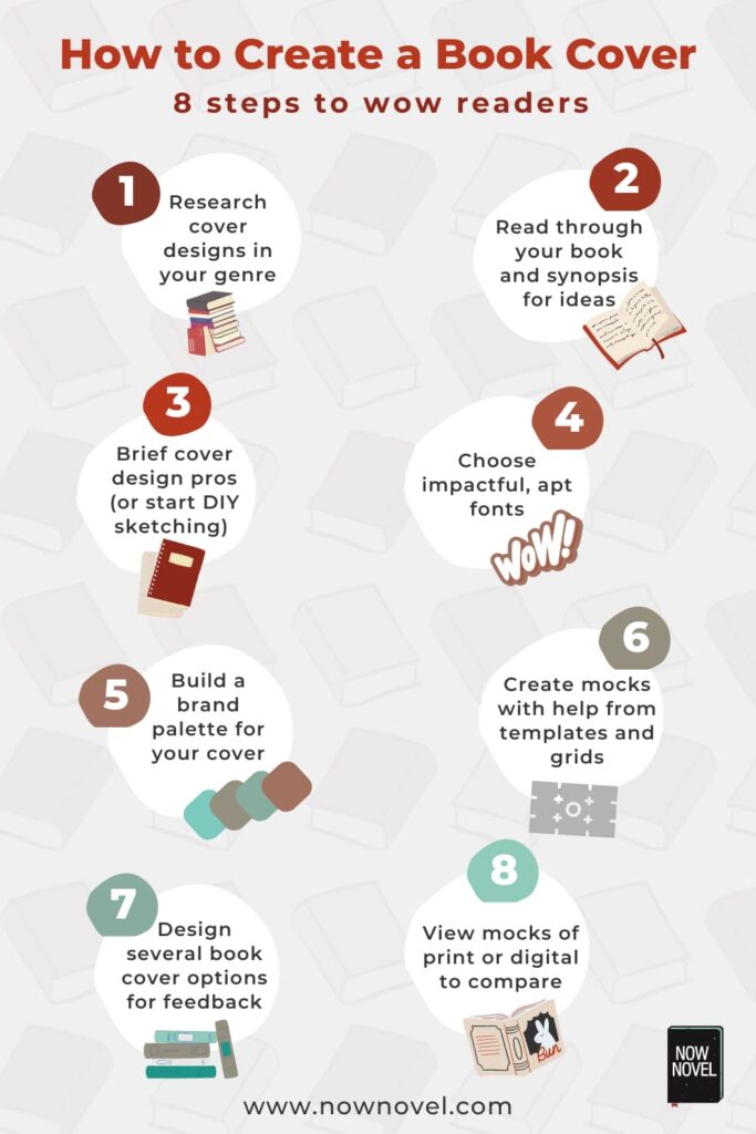
Read eight steps to create a cover that captures the tone, mood and unique appeal of your book:
-
Research book cover designs in your genre.
What color palettes or font styles are typical of your genre? How can your book cover express both genre and the unique appeal of your story?
-
Trawl your synopsis for book cover ideas.
Read through your synopsis (or full story). Note visual details or moments integral to your plot and themes you could use.
-
Brief cover design pros (or start DIY sketching).
Create a brief for a pro cover designer or begin DIY cover design. Professional design will give you the edge.
-
Choose impactful, apt fonts.
Think about how title fonts tell a story. For example, a cursive font may suggest letter-writing in historical fiction.
-
Build a brand palette for your book cover.
Use design tools such as coolers.co by Fabrizio Bianchi to find eye-catching color combinations.
-
Create mock-ups using templates or grids.
Use grid guidelines. The rule of threes and other design principles help you create well-proportioned cover designs.
-
Design several book cover options for feedback.
Using AI tools you could create several detailed mock-ups for fast feedback (or decide the composition's general direction).
-
View cover design mock-ups.
Use tools such as Smartmockups. Find book mock-ups on design platforms such as Behance in editable formats.
Let's explore the above steps to creating book covers with examples, genre insights and further analysis:
Research book cover designs in your genre
To begin cover design research, you could compare covers for bestsellers in your genre. What are key differences between books and genres?
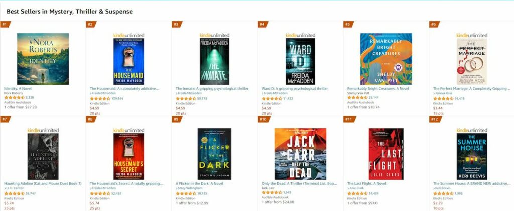
Take, for example, the Mystery, Suspense & Thriller section vs Historical Fiction on Amazon:
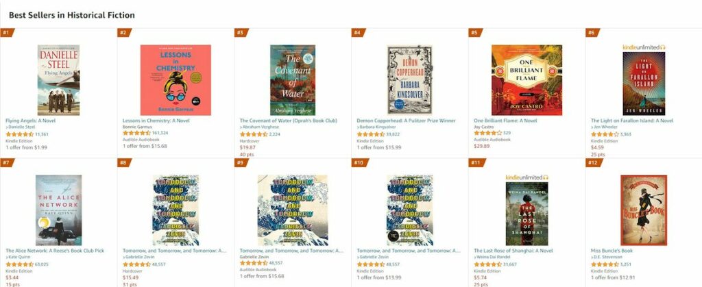
Then the Historical Fiction category:
Ask questions such as:
- What is the typical art style? For example, photographic vs illustrative.
- Do specific title font colors predominate? Mystery, Suspense and Thriller covers often use white and yellow.
- What do covers suggest about the tone and mood of the story? Compare a cover showing a lone historical figure to a more pop art style (such as Bonnie Garmus' Lessons in Chemistry). What does each suggest about the story inside?
An enticing looking e-book builds trust, encouraging readers to get to know your writing.
Book covers by genre: Comparing categories
Let's compare book cover designs across three categories.
The categories chosen were fantasy, mystery, suspense and thriller [ed's note: Amazon lists these as one category], and historical fiction.
Method:
- We described the covers for the first twelve results in bestseller listings for each of the chosen genres. We listed three elements of imagery in each cover (for thirty-six descriptive items per category). We also examined fonts (type and color), color palettes, and point size for titles and author names.
- For each genre, we asked ChatGPT to summarize all twelve natural language descriptions of the book covers into one paragraph. We asked it to favor the most repeated words, images and concepts to aggregate descriptive motifs/elements.
- We prompted Midjourney AI image generation using the summary descriptions of all twelve covers. We also gave the thirty-six imagery descriptions for each category (e.g. 'dragon, engraved emblem, boy surrounded by glow'). This created AI-generated book cover ideas incorporating common design elements in each category.
Fantasy book cover design features and motifs
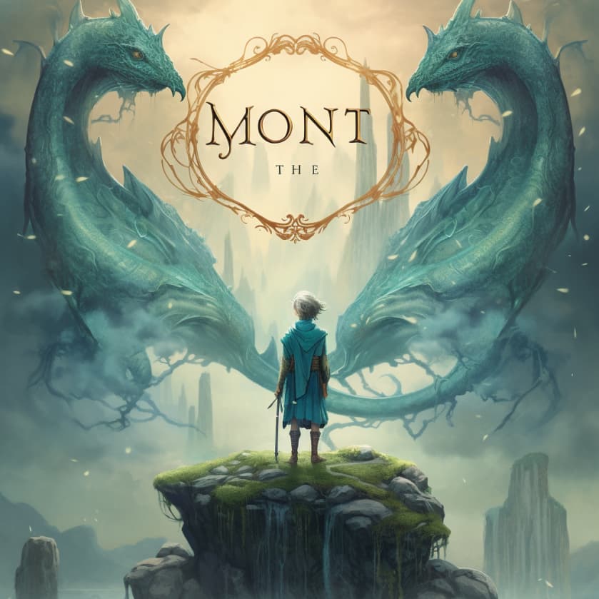
An edited summary aggregating fantasy covers in our sample:
Bold book covers beckon readers into diverse worlds. Teals, greys, amber, blues and browns recur. Cover design artwork shows figures engaged in captivating confrontations. Serif title fonts range from stark black to embossed pink, scrolled navy, white and yellow. Authors' names are highlighted in contrasting hues such as grey and white.
Summary of twelve aggregated fantasy book cover design descriptions.
Keep reading for further book cover design insights.
Mystery, thriller and suspense cover design elements
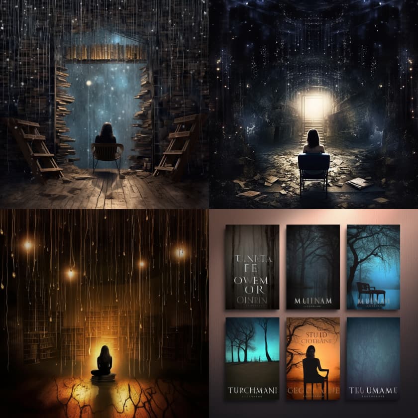
We described the covers of the top twelve listed mystery, thriller and suspense book covers, and again summarized and combined these using ChatGPT (editing for concision):
Cloaked in the mysterious colors of twilight and danger - blue, grey, black, yellow, red - these book covers draw the eye to chilling details. Creepy rooms, blood spatters, or stark empty chairs in gloomy light.
The covers suggest isolation, voyeurism (e.g. lone women in silhouette viewed from a distance), and intrusion. They promise suspense in the looming shadows of mystery and secrecy.
Summary of aggregated book cover design descriptions.
We prompted Midjourney with the above summary and it yielded the following images [ed's note: See the many trees in the cover design mock-ups bottom right. Multiple covers in the sample show empty furniture or night-time woodland scenes.]
Historical fiction cover design elements
We used AI to combine and summarize twelve historical fiction cover descriptions. Example of one of the descriptions:
A woman in decorative historical dress stands back to camera, hair in a bun. In the background is a city skyline replete with Russian Orthodox onion-dome spires. Main colors are gold, red, yellow, orange. The author name is serif and white and one third or less the size of the title, also white sans serif.
Description of Kristen Loesch's The Last Russian Doll
The aggregated description of the twelve covers (edited for concision):
The historical fiction covers of trending books paint vivid tableaus. Women in period dress gaze upon historical cityscapes. Parchment-hued wagons traverse rural landscapes. A vibrant figure advances towards a stone monument at dusk. The blend of bold, decorative typography against a somber dusk palette invites readers into a richly woven past.
Aggregate/summary of twelve written descriptions of historical fiction book covers.
We fed a list of thirty-six imagery details we noted across the twelve covers to Midjourney:
Photographic book cover, combining some or all of these elements: Woman with back to camera, city skyline, decorative historical dress, gender-ambiguous figure, rifle, butterfly, veil, woman gazing, kohl-lined eyes, woman in bustle dress, staircase with carved wooden handrail, patterned wallpaper, wagons, hillside, cloudy sky, cloche hat, suitcase, stone building at dusk, portrait of a woman in paint, painting detail of sunflowers, brooch, train tracks, prison camp, dusk sky with birds, Eagle and laurel wreath symbol, faded map, circular emblem, farm, planted rows, storage silos, bicycle, monument, fighter planes, woman, gloves, ruins
Prompt given to Midjourney (9 out 12 covers were photographic in style)
The resulting image:
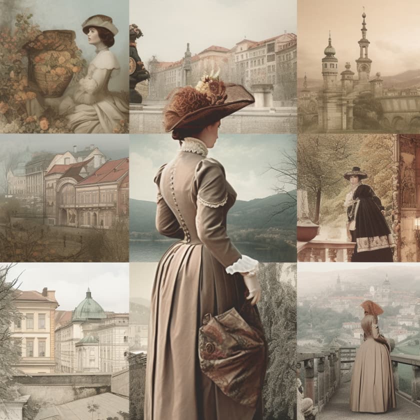
What is interesting is the checkerboard, mosaic-like style of the output wasn't present in any of the historical fiction covers in the sample.
It's an interesting design approach for a historical epic. The tiled layout suggests snapshots of the many destinations a protagonist might visit on her historical journey.
Bring your publishing dreams to life
The world's best editors, designers, and marketers are on Reedsy. Come meet them.
Insights from comparing 36 book cover designs across genres
Comparing the thirty-six book cover designs across these three genres gave us insights into typography, art style, color palette and more:
- Art style: Fantasy books favor digital art styles, while historical fiction and mystery/suspense tend to use a photographic style (ten out of twelve book covers were photographic in both of the latter categories).
- Typography: Fantasy fiction and historical fiction covers were more likely to use serif and decorative (such as scrolled) fonts suggestive of the old, arcane and epic. Mystery/suspense favors starker sans serif.
- Color palettes: Historical fiction tends to use more neutral, 'lifelike' palettes. Fantasy genre covers tend towards earthy teals, mauves and browns, and mystery towards duotone and high contrast primary color designs, prominently incorporating dark tones suggestive of danger or mystery.
- Imagery: Fantasy book covers feature wild beasts and emblems; lone, heroic figures gazing out over mysterious landscapes. Mystery/suspense covers use inference and suggestion. A word with strikethrough. An empty chair which creates questions about who sits there, human absence. Historical is full of signs of era such as monuments and period dress (such as cloche hats and bustle dresses).
A caution to this research exercise: The covers studied were a relatively small sample of thirty-six titles. Using a single merchant platform as the data source also introduces potential bias.
If you were researching design elements, you would likely want to look much wider within your genre, and also widen your study beyond this year's bestsellers to evergreen cover designs and cover design history in your genre.
The exercise nonetheless gives some insights into key differences in art style, font choice, palette and image saturation between genres.
Find book cover ideas in your story synopsis
What imagery and color palette would resonate with the themes, tone, mood, era of your book? What fonts would suit the story, too?
A good starting point is the imagery and motifs in your book.
For example, our fantasy sample had the following list of imagery items we used to prompt the aggregate design:
Dragon, circular emblem, swirling clouds, elemental being, boy with magical glow, water, rock and moss, blue serpent, sword silhouette, blowing leaves, bookstore, swirls, shop façade, flowers, scrolls, flying broomstick, boy, cape, man, dog, wolf, spiral staircase,
List of imagery emblematic of twelve fantasy bestsellers' cover designs.
arrow, engraving, lion, flowers, skull, bottle, night sky.
Make your own comma-separated list of 'keywords' capturing the imagery and themes of your book. Draw on this list of key motifs for design briefing or DIY cover design inspiration.
Brief cover design pros (or start DIY sketching)
Once you have a synopsis and a list of keywords and motifs relevant to your book, you may be ready to brief a professional book designer.
Bob Schram for the Colorado Independent Publishers Association gives a helpful outline of the stages of the book cover design process.
Keep in mind a designer will have their own ideas or insights based on your synopsis (or a full read-through) and the tone, mood and atmosphere of the story.
Professional cover designers will have a specific discovery process. It is typically a mixture of:
- Discovery (learning about your book's most noteworthy features)
- Research (studying how similar stories have been marketed to your target audience through cover design choices)
- Design iteration (creating thumbnail sketches, color swatches, and/or mock designs for your feedback)
Note that if going the traditional publishing route, this consultative process would be held more with the publisher and editor (you may have little say in the final design decisions).
What are the steps for working with a book cover designer?
Briony Hartley, an English graphic designer, typographer and color consultant, gives a succinct outline of the briefing, design, research and feedback stages:
- You brief the book designer.
- The book designer conducts research.
- The book designer experiments.
- Your designer shows you first visuals for feedback.
- Further cover design visuals sharing and feedback.
What about DIY book cover design?
Even if your budget is slim, working with an experienced book cover designer could mean the difference between an OK (or obviously AI-generated) book cover design and a truly bespoke one.
A design of norms and averages vs a design reflecting a professional's nuanced experience with the book trade, typography, the history of cover design, and more.
Keep in mind that because AI tools have been trained on large datasets, images may skew towards the given and expected. The jury is still out on the ethics and legal issues of AI-generated design, too.
If you want to go the DIY cover design route because you're self-publishing and don't have enough budget, or for another reason, find further tips below on choosing fonts, branding your book via color choices, and more.
How can I generate cover design mock-ups in the right aspect ratio?
Initially, most AI image generation tools had limited control over elements such as aspect ratio, outputting square designs. Here's an extra tip if you're using Midjourney to generate ideas for covers, via reader Maria Korolov:
Here’s a Midjourney tip: If you add ” –-ar 2:3″ to the end of your prompt you’ll get a vertical image in the right proportion to be a 1600×2400 book cover.
Maria Korolov, science fiction novelist and magazine editor at MetaStellar, via the comments. Note that you need two dashes before the 'ar'.
Choose impactful, apt fonts
There are five main things to think about when choosing fonts for your book cover:
- Serif vs sans serif. Do you want a smoother, more modern-looking font without 'feet', or a more decorative one? Fantasy covers (per the comparative study above) tend to favor serif more, urban/contemporary genres the sans serif
- Font effects and inference. In our mystery/thriller sample, fonts often supplied extra implications. The word 'perfect' using strikethrough, for example, in The Perfect Marriage by Jeneva Rose, implying a marriage that is far from ideal. Or single title words might be emphasized in larger sizes or different colors
- Contrast and legibility. In book cover design, it's important the contrast between font and background art or color is sufficient for your thumbnail to be legible at different sizes. Remember that your reader might first see your cover on a mobile device.
- Placement and size. Will title font and author name be the same font size? Differing? Title up top or below the author name, or interlocking in some way? In fantasy samples, the title was often up to three times the size of the author name, suggestive of epic scale (and stories). Well-known authors' names tend to get bigger point size (because the name sells the book).
Divide the cover into a three-by-three grid and use the rule of thirds to ensure title and author name are neither crowded too close together or near the edges. This helps to ensure a well-balanced design.
How to choose a font for your cover
Font combinations play a big part in how professional vs DIY book covers look. An extra bold font, for example, paired with a light version of a completely different font, could look way out of proportion.
Free font-picking-and-combing tools such as Monotype can help you find combinations of fonts you like.
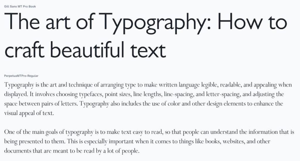
Ask, 'How could my title font style encapsulate or suggest an element of the story?'
As an example, from our historical fiction sample, the cover of Amy Harmon's Where the Lost Wander (2020) is suggestive of its pre-technological 1853 American setting in its juxtaposition between a handwritten-style, cursive title font, and wagons on a hillside.
Similarly, in the mystery/suspense category, the title words glow like fireflies or the flash of headlights in the cover for A Flicker in the Dark (2022) by Stacy Willingham.
Build a brand palette for your book
In her blog post on the book design process, Hartley shares an important branding function of cover design: Conveying to your reader that this is the right book for them.
The book designer is the link between the author and the audience, and has three specific aims:
Briony Hartley, 'What does a book designer actually do?' April 16, 2023.
- To help the author achieve their vision of what they want their book to look like.
- To help the publisher achieve their goal of creating a book that will sell and make money (increase perceived value so it can be sold at a higher price).
- To help the reader choose the right book for them, and understand the text and images inside it, to enjoy the reading experience.
Color palette is one aspect of this visual communication. Will your cover use Pantone's color of the year (Viva Magenta)? Or the trend of big typography with minimalist design and mono- or duotone backgrounds?
If you're thinking of colors to use in your book cover, coolers.co is a fun, free web-based app for finding complimentary colors and their hex values (e.g. Turquoise or #55D6BE).
Branding your book cover: On-trend, or evergreen?
Trends such as busy backgrounds, colors of the year, and flower motifs (listed as 2023 cover design trends by Carpe Librum Book Design) come and go.
More abstract designs (such as the stylish embossed prints by Coralie Bickford-Smith for Penguin Books) may have more enduring appeal.
Says Bickford-Smith, in an interview with Culture Trip, when asked about her favorites among her own designs:
I think the Clothbound Classics would be my favourites – they are what made people notice me. This was when e-books were flooding the market, and I really wanted to go back to the beautiful Victorian bindings, appreciating the beauty of the physical book, and using the printing press in really amazing ways.
Coralie Bickford-Smith, interviewed by Tara Heuzé, January 2017
Read through your book for color inspirations and imagery you could base your cover's branding off. Which imagery may have enduring, trend-surpassing visual appeal?
Create mock-ups using templates or grids
In design, as in writing, feedback will help you grow and refine your ideas.
Once you have some ideas, create mock-ups using book templates or use grids such as a three-by-three, 'rule of threes' grid in a design app.
Here is an example using the image we generated for a hypothetical historical fiction book cover. The title font is Cormorant Garamond Bold, and the author name font is Futura.
As an exercise, try creating a cover mock-up using the same image above or your own. Try a cursive title font suggestive of a personal letter. Extra points: Use tools such as background eraser to customize the design further.
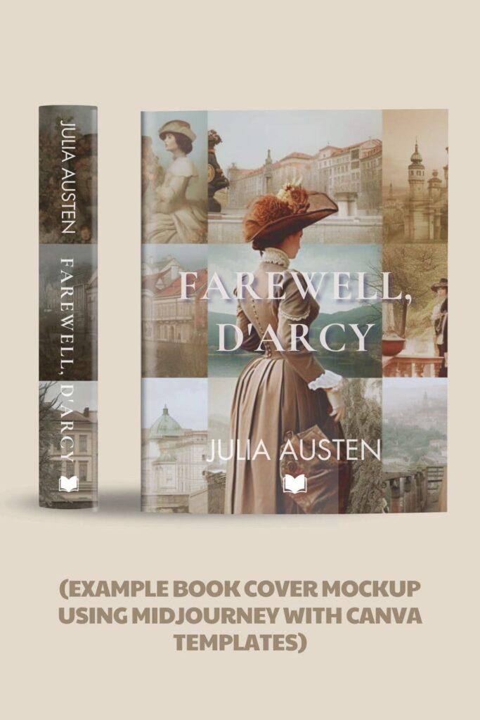
Canva offers a broad range of free book cover templates you can edit, customize and print.
Design several book cover options for feedback
Professional book cover designers don't typically pick one idea and stick with it. They iterate, try different things.
One way to make sure you choose the right book cover design is to come up with multiple options you show to a trusted circle.
A Now Novel member recently shared a Pinterest board of potential designs for her next book's cover in the Now Novel groups, for members' feedback.
Keeping a board such as this is a fantastic way to canvas people you know with a talent or eye for design (or simply gather gut reactions and majority consensus).
This is where AI could prove useful in coming up with ideas. For the design newbie, it makes it easier to explore composition ideas and design elements quickly.
View cover design mock-ups
Besides templates in design apps such as Canva, there are many tools for creating virtual print books to see how your book's cover design will look.
Smartmockups is one tool that enables you to create high-resolution samples of your cover design integrated into various contexts. A hand holding your book, say, or a contextual image such as your book occupying premium display space at a bookstore.
You can also find .PSD-format mock-up templates for Photoshop on design-portfolio sites such as Behance. For example, this simple front and back cover design.
🗣️ What is one of your favorite covers of all time, and why? Or what do you find challenging about cover design? Sound off in the comments!
Join Now Novel and share design mock-ups in a constructive community. Get professional editing to ensure you follow through on an inspired jacket with a great read.
FAQs on how to create a book cover
Find answers to several frequently asked questions about book cover design:
The industry standard most guides list first is Adobe InDesign (paid). Grace Fussell gives a detailed tutorial on cover design in Adobe InDesign for EnvatoTuts+.
If learning the tools book design professionals use is intimidating, apps such as Canva have free, customizable book cover templates. The Home Boss on YouTube has a handy guide to cover design in Canva.
Design stock platforms such as Adobe Stock and Freepik offer book cover templates in editable formats such as Adobe .PSD. These include mock-up templates and book cover thumbnail templates.
An advantage of Canva's book cover templates is that you don't need to install or learn more advanced design software (though this does mean reduced functionality and control).
As of 2023, $500 in USD (according to Derek Murphy of Creativindie, though he gives a true range of $250 to $750, depending on the designer's experience and the contents of the design package).
Reedsy, by comparison, gives a range of $500-800 (keep in mind that as a marketplace, Reedsy would take a cut so likely factors this into quoted pricing).
Browse books in your genre. Note anything you love. Explore lists such as LitHub's 'The 103 Best Book Covers of 2022' (includes commentary by designers).


I am considering publishing my debut legal thriller novel with social implications and would like some suggestions.
Arnold White - Almost 2 years ago
Hi Arnold, thank you for sharing that. It is quite a broad description, though if it is a legal thriller representation of environs such as court or symbols associated with the law (gavels, scales of justice, or the less obvious) may be a place to start. I would suggest making a list of possible tableaux, scenes and objects relevant to your story and brainstorming and playing from there. I hope this is helpful.
Jordan - Almost 2 years ago
Here's a Midjourney tip: If you add " --ar 2:3" to the end of your prompt you'll get a vertical image in the right proportion to be a 1600x2400 book cover.
Maria V Korolov - Almost 2 years ago
Hi Maria, thanks for this fantastic addition, will add to post and credit you. I'm very much a Midjourney 'noob' at this point still :) Been seeing the intriguing results people get with various ratio prompts.
Jordan - Almost 2 years ago