Graphic novels offer engaging ways to marry text-based narrative and visual storytelling. Read 5 ways you can use elements such as illustrative style and strong symbols to enliven your story:
Ideas for writing visual novels:
- What are graphics novels?
- Find the right visual style for your subject and themes
- Show tone and emotion
- Use memorable visual symbols
- Set the scene visually
- Balance visual and textual narrative
What are graphic novels?
What sets a graphic novel apart from a comic book? Or a graphic novel from an illustrated book?
Graphic novels such as Art Spiegelman's devastating World War II epic Maus or Alejandro Jodorowsky and Jean Giraud's space opera The Incal use familiar elements from the world of comic books. For example, the division of the page into visual panels representing sequential events.
Other details such as dialogue balloons and boxes for characters' speech, or sound effects rendered using onomatopoeia in bold fonts (such as 'CRASH!' for an impact) are also common.
Despite similarities in how they use elements of representation, graphic novels tend to be longer than comic books. The storyline in an Asterix comic is typically 44 pages long, whereas the hardcover edition of The Incal runs to 308 pages.
Graphic novels also often engage with more adult themes. For example, the Holocaust subject matter of Spiegelman's Maus. Comic books tend to be aimed towards 'kids of all ages'.
So how do you write an engaging graphic novel?
1. Find the right visual style for your subject and themes
Many stories are as famous for their illustrations as their text.
Take, for example, Sir Quentin Blake's whimsical illustrations for Roald Dahl's children's books:
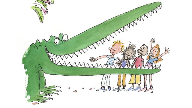
Blake's whimsical, bold style is a perfect match for Dahl's often macarbre stories. Maniacal animals and witches fill their pages, as well as scruffy kids and diabolical duos like 'The Twits'.
Blake's illustrative style brings out the stories' irreverent, 'wicked' tone.
Example of visual style matching themes in a graphic novel: Maus
Art Spiegelman's Maus tells the harrowing story of the artist's father's survival as a Polish Jew during the Holocaust.
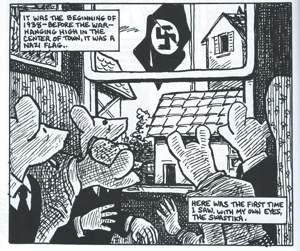
There are many ways style matches subject and theme in Spiegelman's work:
- Black and white: The choice to render the story mostly monochromatically suggests the passage of time, according to Shane Gramlich. This is fitting for a story told via flashbacks as the artist interviews his father and his father recalls memories fom the war
- Representation: Spiegelman depicts Jewish people as mice and nazis as cats, which is evocative of many aspects of the time. For example, the idea of hunter and hunted. Or the dehumanizing propaganda used to justify 'extermination' in Adolf Hitler's plan. Like the black and white, this choice makes the situations and power dynamics in the story more stark
The visual style you choose to accompany your work may add layers of meaning and suggestion, giving additional resonance to the story.
2. Show tone and emotion
In writing, we often say 'show, don't tell' (although a balance between both is key).
Graphic novels provide many ways to show the emotion in a scene. For example, using a jagged font in a jagged speech bubble.
Example of showing tone and emotion: Captain Haddock's outbursts
Take, for example, this moment in Hergé's Tintin comics, when the hard-drinking, ever-cursing Captain Haddock takes a sip of what he thinks is his favourite whiskey:
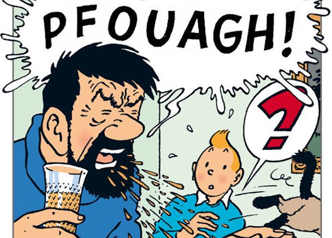
The use of onomatopoeia (a word mimicking a sound) conveys the captain's shock and disgust, as does the jagged edge of the speech bubble jutting beyond the frame's border. The hind quarters of a cat, exiting the frame, suggest the exposiveness of the outburst.
Haddock's disgust (and the immediate spitting out of the offending drink) is palpable, thanks to stylistic visual choices.
3. Use memorable visual symbols
Graphic novels provide extra ways to give your story cohesion.
In addition to recurring characters, settings and other elements in common with text-only novels, you can find visual symbols that unify graphic novels and draw readers' attention to interesting themes.
Think, for example, of the unsettling power of the Swastika in the panel from Maus above, and the vulnerability of the mice staring in fear and awe at it through through window.
Many characters in comic books and graphic novels have such distinctive silhouettes we could identify them from their outlines alone. For example, Asterix, Obelix and Dogmatix from Goscinny and Uderzo's Asterix series:
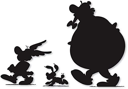
Asterix's winged hat, or the bows in Obelix's plaited beard, are immediately recognizable symbols that create character (as are their shapes).
A simple accessory - a hat, a veil - becomes a trademark breathing life into a character in a graphic novel.
Memorable symbols in graphic novels: The veil in Persepolis
Marjane Satrapi's graphic novel Persepolis, about her childhood and early adult years during the Islamic Revolution in Iran, uses the veil powerfully as a visual symbol.
At times Satrapi uses the veil's uniform-like quality paradoxically, to draw attention to difference. For example, the way the girls' differing facial expressions stand out in the second panel on Page 1:
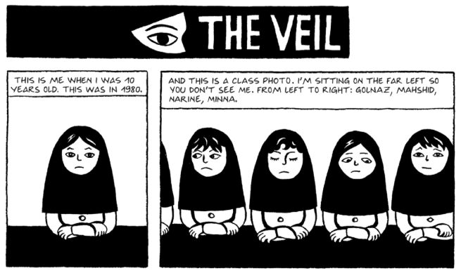
Some look sideways, some are downcast, some gaze directly at the viewer.
A sense of each girl having a distinct personality and emotional lifeworld regardless of what she's wearing, suggests the overlapping of individual and collective expression and identity.
Even the use of the veil to provide a striking highlight to the text in the chapter's title uses this symbol and motif creatively. Gazing out of the dark, the lone eye suggests the eye of an observer, looking out on a complex political and social world.
Faces and eyes in this partially occluded world have greater storytelling power.
For example, the focus on the intensity in the man's eyes as he announces the closing of bilingual schools on Page 4:
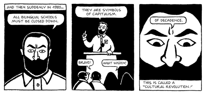
Like the girls' veils, the black framing of the man's face emphasizes his emotion, the furrow between his brows and wide-eyed stare suggesting his loathing towards 'capitalist decadence'. Here, the man's 'veiling' in the final frame suggests the opposite of individual character, an angry state functionary, the lone speaker disappears into a fight for collective beliefs.
The visual language of veils and occlusion thus fills the first two pages of the graphic novel. It helps to establish a world where individual liberty and social dictates are frequently at odds with one another.
4. Set the scene visually
Graphic novels provide author and illustrator the means to create dramatic backdrops to events and a colorful sense of place.
The details of 1940s dress, coupled with the stark and troubling imagery of the swastika in Maus together create a rich, visual sense of context.
When we tell a story using text alone, we might spend pages establishing setting. The beauty of a visual story format is we can convey a sense of place in just one frame.
For example, here Jodorowsky and illustrator Jean Giraud show a smaller space craft coming in to dock, passing through a larger one's 'psychic barrier':
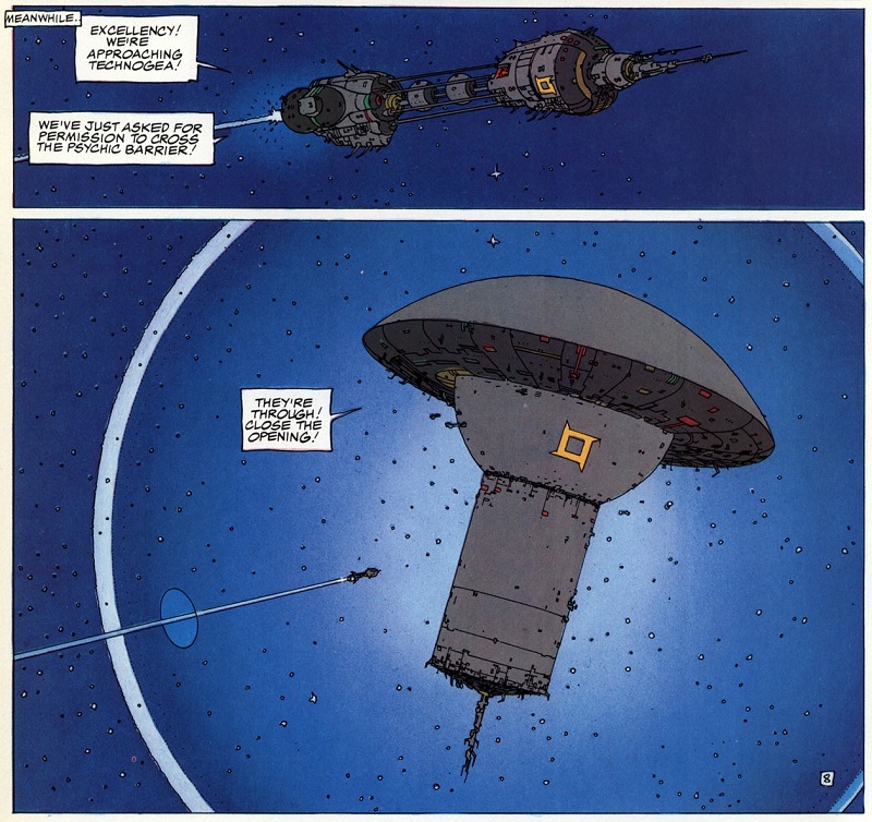
Thanks to the visual medium, scene-setting itself may be dramatic and awe-inspiring, through the use of colour, form and movement.
5. Balance visual and textual narrative
Visual narrative is storytelling using visual elements; textual narrative is storytelling using words on the page.
In the best graphic novels, such as Persepolis or The Incal, each is supplementary to the other.
We saw in Satrapi's book how the image of the veil emphasizes intricate relationships between individual and collective identity, for example. The visuals supply a deeper sense of context.
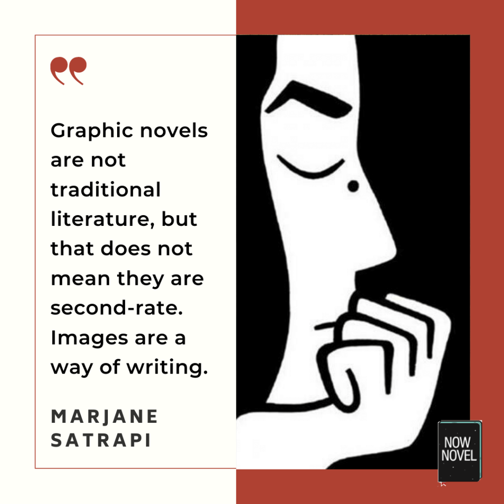
Here, the visual components provide a 'yes, and...'. They give additional context, and texture.
We get not just the taste of the wrong whiskey, but the spray of the Captain's spit, the startled cat leaping off the lap. They add the detail, personality, colour, movement and form that make visual storytelling its own satisfying medium.
Outline characters and worlds for your graphic novel (or text only novel) in the Now Novel dashboard.


I like all of the tips that you had given me to start my own graphic novel I will use these because these are very helpful. thank u
Makaylee And Ranae - About 4 years ago
It's a pleasure, good luck with your graphic novel!
Jordan - About 4 years ago
I am having my students create a graphic novel. Is there a good template/outline you would suggest for them to use in the process? Kind Regards, Mr. McDowell
Josiah - About 4 years ago
Hi Josiah, that sounds like a fun assignment. I would suggest creating a worksheet with visual storyboarding panels they can fill out with sketches of ideas for layout and such. You could also have them use the first free parts of our story outlining tools to create a story outline and character profile. A storyboarding template with this sort of graphic-novel-panel format might help.
Jordan - About 4 years ago