So, you’ve finished writing your book — congratulations! Now comes the part that makes many authors scratch their heads: formatting. How do you make your book look professional?
Whether you're planning to self-publish an ebook or preparing a manuscript for print, I'll walk you through everything you need to consider and share some of the best tools for formatting a book seamlessly. Let’s dive in!
1. Customize your page margins
The first thing to consider is… margins! Think of them as your book's personal space — too little, and it feels cramped; too much, and it's swimming in white space. Proper margins give your book a professional look while ensuring your readers don't feel overwhelmed by densely packed text.
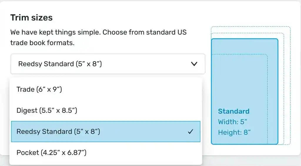
Your margin size will depend on your book’s trim size. There are several standard book sizes in publishing, but for the sake of simplicity, let’s focus on the most popular ones:
- 5.5” x 8.5” (digest): 0.75" outer margins, 0.875" inner margins. This size is often used for fiction and nonfiction books that prioritize portability while maintaining an elegant layout.
- 6” x 9” (U.S. trade): 0.875" outer margins, 1" inner margins. This trim size is preferred for novels and professional books, offering a balance between readability and a polished, trade-quality appearance.

Now, how do you take care of your book’s margins? It depends on which tool you use to format it. If you’re using a program like Microsoft Word or Google Docs, you go to Layout > Margins > Custom Margins, or File > Page Setup, and manually input the margin values to match your desired dimensions. That said, these tools are not specifically designed for book formatting.
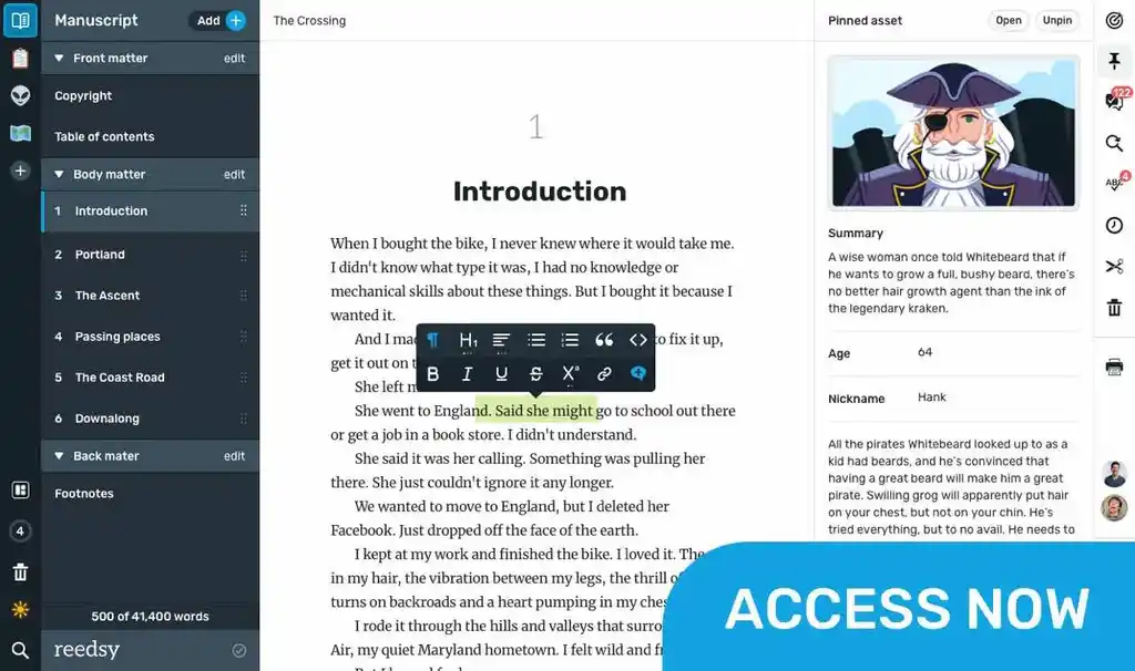
There are professional formatting tools like Reedsy Studio or Vellum that automatically apply the correct margins when you export your book as a PDF or EPUB, ensuring that your layout meets industry standards without requiring additional adjustments.
The next step is to pick a great font…
2. Pick a font that’s easy to read
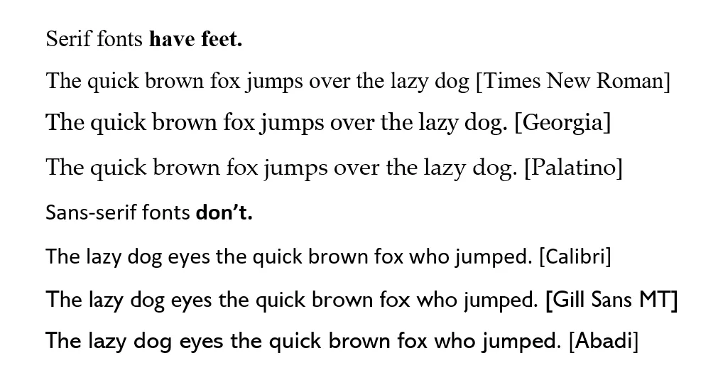
Let's talk fonts — because nobody wants to read 300 pages of Comic Sans (trust me on this one). The best fonts are easy on the eyes, aesthetically pleasing, and commonly used in the publishing industry. As a general rule, serif fonts work best for print, while sans-serif fonts are ideal for ebooks.
Here are some good options:
- Serif fonts (best for print): Times New Roman, EB Garamond, Georgia, Lora, etc. Serif fonts are preferred for printed books because their small decorative strokes help guide the reader’s eyes smoothly across the page.
- Sans-serif fonts (best for digital books): Calibri, Arial, Helvetica, etc. Sans-serif fonts lack the additional strokes of serif fonts, making them ideal for digital reading. They provide a crisp, clean look on screens and ensure maximum readability across different devices and lighting conditions.
In terms of font size, stick with 11 or 12 pt font for print. If you’re formatting an ebook, you can go slightly larger at 12 to 14 pt to accommodate screen reading. Readers can adjust font sizes on most e-readers, but setting a standard size ensures your book appears well-formatted from the start.
As a general rule of thumb, avoid using more than two different fonts in your book — consistency in typography is key to maintaining a simple and refined reading experience.
3. Style your text, paragraphs, and chapters
Your manuscript should be easy on the eyes, not only in terms of font choice but also in formatting consistency. Properly structured paragraphs and chapter layouts significantly improve readability and give your book a polished feel.
Here are some other things to keep in mind:
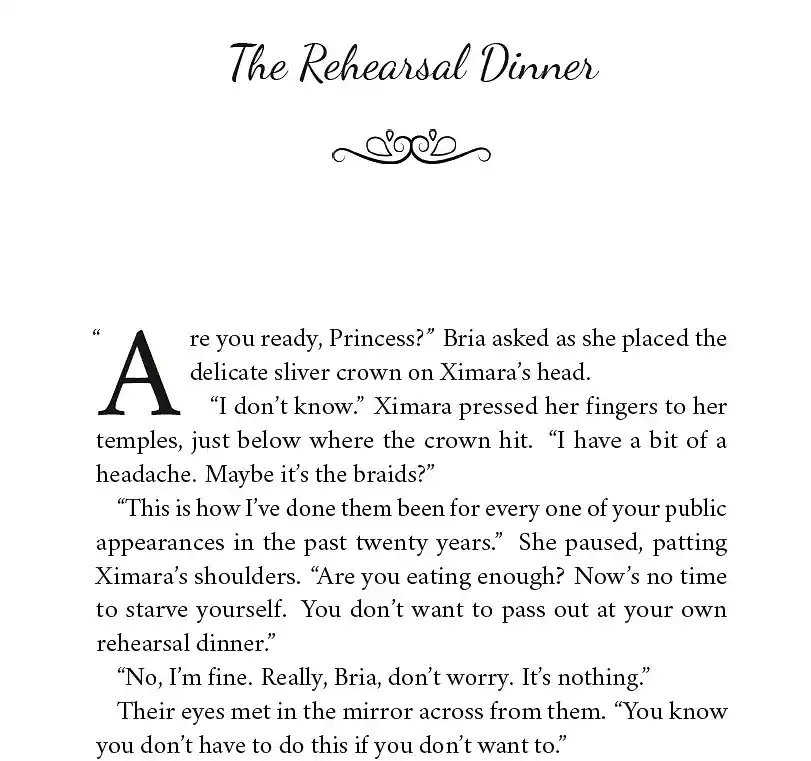
- Paragraphs: Indent the first line by 0.5 inches. (Never use spaces or tabs! Set this up in your document’s settings, or use a pro tool that does it automatically). Proper indentation ensures that paragraphs are visually distinct without adding unnecessary spacing between lines, which can disrupt the flow of reading.
- Line spacing: Use 1.5 or double-spacing for a clean look. Double-spacing is often preferred for manuscripts submitted to editors and agents, while 1.5 spacing works well for finished books, making text easy to read without appearing overly spaced out.
- Justification: Fully justify text for print books, but leave it left-aligned for ebooks. Justified text creates a uniform appearance along both margins in print, whereas left-aligned text prevents awkward gaps in digital formats, where line width can vary based on screen size.
- Chapter headings: Choose a distinct yet readable font that complements your book’s genre and tone. Chapter titles offer a chance for subtle creativity — romance novels often use elegant, script-like fonts, while thrillers or sci-fi books might lean toward bold, modern typefaces. Regardless of style, ensure the font remains legible and doesn’t distract from the content. (As a rule of thumb, avoid using more than two different fonts in your book — consistency in typography is key to maintaining a simple and classy reading experience.)
But taking care of your page layout goes beyond just selecting good line spacing and chapter headings…
Refine the details
A poorly designed layout can lead to a frustrating reading experience and disrupt your readers' focus. To ensure your book flows smoothly, there are a few essential layout principles to keep in mind:
- Kerning & Letter Spacing: Adjusting the space between characters to improve readability and avoid letters appearing too cramped or too far apart. Proper kerning enhances the visual harmony of the text and ensures a polished, professional look.
- Orphans & Widows: Avoid single lines of text left at the beginning or end of a page, as they can disrupt the reader’s flow and make the layout look unbalanced. Manually adjusting paragraph breaks or tweaking line spacing can help prevent this issue.
- Scene & Page Breaks: When transitioning between scenes within a chapter — whether due to a change in time, location, or perspective — clearly indicate the shift with a scene break. This can be done using a dinkus (∗ ∗ ∗ or ~~~) or by inserting a blank line to signal the transition smoothly.
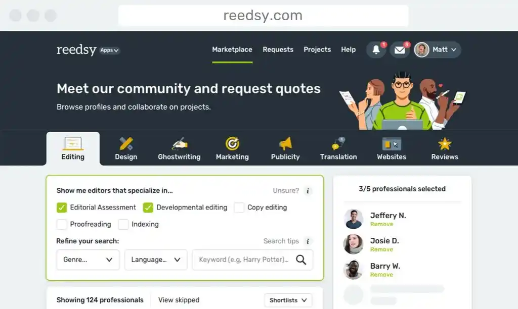
If all this makes your head spin, there's no shame in hiring help! Consider working with a professional through platforms like Reedsy Marketplace or Freelancer.com. Working with a professional ensures that your book meets industry standards, maintains consistent styling, and appears polished across different formats. Remember: a professional formatter might cost money, but so does therapy after trying to fix orphans and widows for eight hours straight.
4. Add page headings and numbers
Let's talk about the quiet champions of book formatting — page headers and numbers. They might not be as glamorous as your chapter titles or as exciting as your plot twists, but they're the faithful guides that keep your readers from getting lost in the reading wilderness.
📃 Page headings: Add chapter titles or the author’s name on alternating pages. Headers help maintain a sense of orientation within the book, providing readers with subtle yet crucial guidance on their location in the text. This is particularly useful for nonfiction books, where readers may frequently reference specific sections.
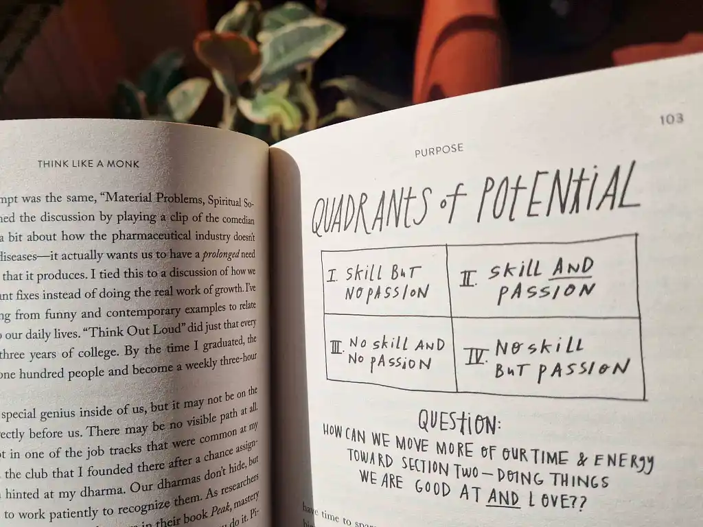
1️⃣ Page numbers: Begin numbering from the first chapter (not the title page). Page numbers help readers track their progress and return to important sections easily. For print books, page numbers work well in the top outer corners alongside headers (or else in the bottom corners or center). In ebooks, however, they’re less relevant since digital readers typically track progress and location instead.
👌 Pro tip: Use Roman numerals for the front matter (i, ii, iii), then switch to standard ones (1, 2, 3) for the main content. This helps distinguish the introductory sections from the main narrative, making it easier for readers to navigate.
Remember: while these elements might seem like small details, they're the difference between a book that feels professionally published and one that screams "I formatted this at 3 AM after my third cup of coffee!" Take the time to get them right — your readers will thank you (silently, while they're too engrossed in your story).
5. Include the front and back matter
Your book isn’t just the main content — it also includes essential front and back matter. These sections provide important details about the book and its author, enhancing credibility and offering additional value to the reader. They comprise various things, but at the very least they should include:
📖 Front Matter:
- Title page: Centered title and author name, clearly identifying the book.
- Copyright page: Publishing rights, ISBN, disclaimers, and publisher information. This page ensures legal protection and gives official publication details, making your book look well-organized and credible.
- Table of contents: A clickable feature in ebooks that enhances navigation. This allows readers to jump to sections of interest quickly, which is especially useful for nonfiction and reference books. It’s a must in novels and print books too.
📖 Back Matter:
- About the Author: A brief biography and your other works.
- Acknowledgments: Space to thank those who contributed to your book.
- Index (if needed): Useful for nonfiction books requiring organized references.
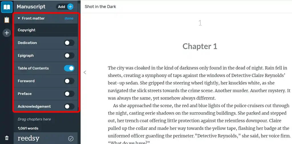
The best formatting tools will allow you to add and edit these sections quickly and easily. Speaking of which…
The best tools for book formatting
Various tools can help with book formatting, from basic to advanced options. Selecting the right tool depends on your level of experience, desired complexity, and whether you’re preparing an ebook, print book, or both.
Here are some of the most popular ones:
|
⚙️ Software |
💻 OS |
💸 Cost |
🏆 Best for |
|
Reedsy Studio |
Web |
Free |
Self-published authors who need a professional layout without complex tools |
|
Microsoft Word/Google Docs |
Windows, Mac, Web |
Free (Google Docs), $69.99/yr (Word) |
Simple formatting and widely accessible, but limited for print layouts |
|
Scrivener |
Windows, Mac |
$59.99 one-time fee |
Authors who need extensive outlining and structuring |
|
Vellum |
Mac |
$199.99 to export ebooks only or $249.99 for ebooks and print |
Effortless ebook and print formatting |
|
Adobe In-Design |
Windows, Mac |
$276/yr |
Complex layouts requiring professional design expertise |
The best tool is the one you'll actually use, so don't get caught up in features you'll never need — pick something that matches your skills, budget, and publishing goals. A well-formatted book isn't just about aesthetics; it's about creating a seamless reading experience that keeps your readers immersed in your story or message.
Whatever you use, taking the time to perfect your book’s layout ensures a better reading experience and gives your book the best shot at success. Good luck!




New authors often underestimate the importance of good formatting. Some great tips and advice! Thanks!
Clayton Hobbs - About 2 years ago
Thanks, Clayton, thank you for reading our blog and taking the time to comment.
Jordan - About 2 years ago
This post is very helpful for my next projects. I notice different valid points in this article. I will try to use these tips in my upcoming projects. Thanks.
Oliver Wood - About 2 years ago
Thank you Oliver, thanks for your feedback and for reading our articles.
Jordan - About 2 years ago
How do I format a book?
John - Almost 2 years ago
Hi there, thank you for sharing your question. That is a very broad question but some do's and don'ts: - Do use proper page and line-level indentation settings rather than tab for indents as this is more consistent and avoids conflicts if multiple people are working on the same document. - Do look at publishers' guidelines for submissions as they usually give a good indication. Most want at least 1.5 line spacing, for example, as it makes it much easier to read. - Do consider hiring a professional to format your book (or else use software such as Vellum which has a premium but can output tidier manuscripts with less fuss). - Do be consistent in things such as margins, spacing (between words and how you space lines, paragraphs, etc.). Mixed styles are often a tell something hasn't been formatted professionally. - Don't use an odd font (no comic sans) - something crisp and 'ordinary' (ish) is the norm (e.g. a serif font). - Don't use tiny or enormous print (around 12-point print is fairly standard). You can find more formatting guidelines on the web but I'd strongly recommend either learning the ins and outs thoroughly enough to do a good job or hiring someone to do it. Reedsy gives cover page and other templates here and there are many further resources you can find.
Jordan - Almost 2 years ago